Develop healthy habits
Designing a health and wellness mobile app for personal development
ROLE
UX Designer
DURATION
May - Dec 2019
Early in my career, I received an opportunity to design a learning platform called MasterLife, which is dedicated to developing different aspects of life. This app offers a variety of programs ranging from Relationship, Spirituality, Personal Growth, Health, Fun, Business & Career, Finance, and Contribution.
A self-paced and community-based learning ecosystem focused on personal growth.
The National youth policy of India (2003) defines the age group 15 - 35 years as the youth population. Within this group, 10 - 30 percent of young people suffer from nutritional deficiency, emotional and behavioural problems, mental disorders, and high-risk behaviours. Master Life offers research-based content and courses on emotional health, career, financial success, romantic relationships, and productivity. These resources aim to help young people lead a fulfilling life.
My role
I worked as a lead UX designer in this project. My roles involve conducting workshops with the client for understanding requirements, design strategy, conducting research, creating research report and visual designs.
I closely collaborated with engineers, content writer at every step of this project.
Understanding the client’s need
Through a series of workshops, I delved into the client’s product vision, hearing their ideas and sketching out concepts on whiteboards. My main goal during the workshop was to explore the problem that this app aims to solve.
-
Who is the target demographic for this?
-
What age group is mainly focused on?
-
What is the plan for rolling out this new product?
-
How are the courses structured and planned?
-
What kind of research was involved in this?
-
How is the success of the app defined?

Getting to know the competitors
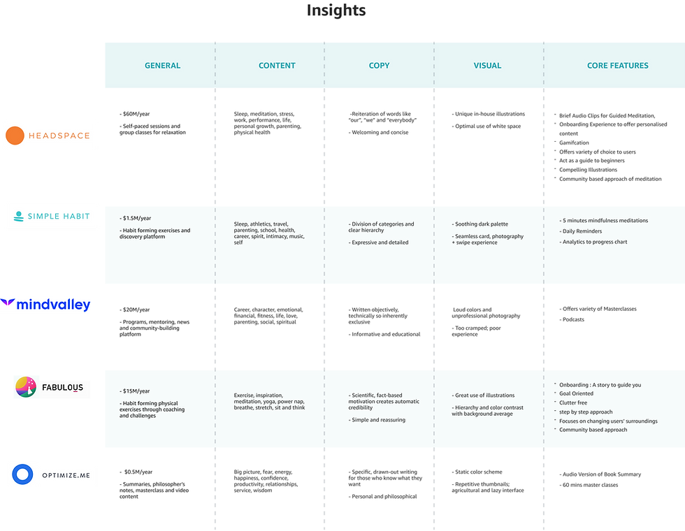
Understanding how existing competitors are performing help us to know the market space, gaps, strength and weaknesses of these products. We can collect actionable insights at this stage that can help us identifying trends and uncover opportunities.
Here I have selected 5 major competitors to understand their market share, core features , content strategy and visuals..
How are people currently focusing on their personal growth?
What did we hear?
“My biggest issue is focus. Whenever I start something, I go all out but then eventually I lose the spark.”
“I often feel pressure that others are doing better then me.”
“Once I Joined a programme on weight loss in an app,I struggle to follow the instructions.The app was very generalised, I did n’t feel like my need was understood enough.”

Gathering insights from scattered data
After conducting interviews I have collated interview data to infer the insights. I have grouped all the major insights under 4 different categories through a affinity mapping exercise.

Themes found from interview insights
Content: They want content addressing challenges faced by Indian youth. As generic content is easily available online, they are looking for research-driven content with fewer instructions that continuously evolves.
Motivation: Participants often feel distracted when trying to develop a new habit. They constantly seek motivation because they easily lose track. They set goals, but struggle to maintain consistency. They desire step-by-step guidance and smaller tasks.
Human intervention: People taking part in the interview look for others with a similar level of motivation. They often try new apps based on advice from friends. When their friends use a specific platform, it highly encourages them to do the same.
Tracking progress: Participants desire consistent feedback to monitor daily advancements. To gauge their improvement, they seek out a progress graph. They are interested in assessing their performance relative to others.

Identifying the opportunity areas
From the key insights uncovered during interview sessions helped me to identify opportunity areas. At this stage, I started reframing the insights as generative questions.

To evaluate the design at an early phase, I started conducting user testing.
As part of user testing, users were asked to onboard and navigate the platform. I observed that majority users faced difficulty with two choices: “Go to program” and “Explore the app.” Originally, the idea was to include these decision points in the onboarding flow. “Go to Program” leads to in progress courses, while “Explore the app” leads to the homepage with content options. We aimed to make ongoing courses easily accessible. They found this confusing. They clicked on “Go to Program” assuming it was the app’s homepage. As a result, 4 out of 5 users missed the homepage and app content.

Some lessons from early user testing
Life assessment score: Users found life assessment very effective in evaluating different areas of their life. They were expecting it to be easily discoverable.
Breaking large content into sections: User was finding it hard to follow through the large content with a long scroll. One such section was “Book summary”, which was later divided into multiple sections as tabs for easy navigation and reducing cognitive load.
Clear terminology: Users were struggling to understand the ambiguities around terminologies. I realized the terminologies need to be clear and direct.

Creating a visual language
I used a mix of dark and white UI theme. Dark backgrounds reduce eye strain in low light. I’ve placed all the graphic elements on dark themes. Reading long text on a black background is challenging. I used a white background for text to solve the readability issue.
I have grouped content into three major categories. Heart, body, head. Pink symbolizes relationship and spirituality. Green was chosen to symbolize the body, reflecting sustainability and ecology. Blue is the symbol of growth in career, finance, and contribution. Our principal designer assisted me in grasping style guide design and color psychology. colors.

Recommendations based on life assessment score
During the early user testing, I found out that people are really interested in taking life assessments. To make life assessment impactful, I proposed adding suggested courses based on assessment results. So that users can focus on areas which need their attention.


Show long content without overwhelming cognitive load.
During the early user testing, I found users are experiencing difficulty to follow through large chunks of text. I have broken down the text in multiple sections and presented it as tabs for easy navigation.

Easy content discovery through search
Masterlife has a variety of content related to eight major aspects of life. Search allows user to find their desired content quickly and easily.

Segmenting module content for enhanced decision-making.
Users will have a clear direction to segregate between upcoming, finished and future courses which are yet to be unlocked.
Leaderboard for tracking progress
At the end of every course, users can track their progress and overall performance for that specific course. The leaderboard gives them a summarized view of completed tasks, provides ranking based on internal algorithms, personalized messages from the course instructor, and community performance.


Tracking Course Progress, Segregation of Ongoing and Completed courses
The Continue program section will have a progress bar to give an overall view of course completion status.
Profile tab will have my courses which presents the ongoing and completed courses.
Impact
With the beta launch with selected participants, we saw 2,129 program subscribers. Average time spent on the platform was 10 mins.
Learnings
This project taught me several lessons about conducting effective exploratory research interviews. Good follow-up questions uncover quality insights, and a fixed questionnaire may not reveal everything. Adapting to new insights during the conversation is important, but staying focused is also crucial. Sometimes, remaining silent allows the interviewee to open up more.